Pop Up Footer – The Revival With CSS Transitions
I thought we should look a look back at one of my older tutorials and revamp it with the help of CSS transitions. I am also going to show how you can have it automagically fallback to JavaScript animation should CSS transitions not be available in the visitors browser.
There are two ways to do this. The first is the classic class swapping method, the second is a handy jQuery plugin called Transit. This demo shows the first method.
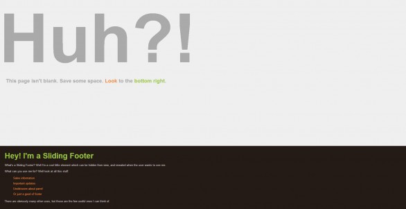
If you take a peek it probably looks no different to the original Pop Up Footer post. However if you dig into the source you’ll see that the animation for this footer is created using CSS, which is browser native and faster in mobile browsers, instead of the original which used only jQuery to animate the footer.
CSS
First we need some CSS. The code is the same as the original pop up footer code. I’m not going to repeat the original code here. Instead here is the only extra CSS needed.
|
1 2 3 4 5 6 7 8 9 10 11 |
#footerSlideContent { /* ... Original CSS - Add this to end ... */ -webkit-transition: height 300ms ease-in; -moz-transition: height 300ms ease-in; -ms-transition: height 300ms ease-in; -o-transition: height 300ms ease-in; transition: height 300ms ease-in; } #footerSlideContent.open { height: 300px; } |
jQuery
The HTML is also the same as the original pop up footer code so again I’m not going to repeat it. The only minor difference is the need to include the Modernizr library onto your page.
The jQuery is different so let’s take a look at that.
|
1 2 3 4 5 6 7 8 9 10 11 12 13 14 15 16 17 18 19 20 21 22 |
jQuery(function($) { var open = false; $('#footerSlideButton').click(function () { if(open === false) { if(Modernizr.csstransitions) { $('#footerSlideContent').addClass('open'); } else { $('#footerSlideContent').animate({ height: '300px' }); } $(this).css('backgroundPosition', 'bottom left'); open = true; } else { if(Modernizr.csstransitions) { $('#footerSlideContent').removeClass('open'); } else { $('#footerSlideContent').animate({ height: '0px' }); } $(this).css('backgroundPosition', 'top left'); open = false; } }); }); |
As you can see it has a few changes. Most notably, how the animation is achieved. First we use Modernizr to check if the visitor’s browser has CSS transitions available. If transitions are available we add the open class. At this point CSS automatically takes over & animates the footer to the height set in your CSS. Awesome! If transitions are not available we fall back to the good old jQuery animation method. The bad thing is obviously the need to repeat code, but CSS animations are rendered in browser and are generally faster. Especially on mobile devices!
The jQuery/CSS Alternative
There is an alternative method to swapping classes. You can use a jQuery plugin called Transit. Just use the jQuery from the original pop up footer tutorial and replace the animate method with the transition method. The only downside is the default fallback is to do nothing & the alternatives are either to delegate transition to animate if CSS transitions aren’t supported:
|
1 2 3 |
//Modernizr is not needed here... if (!$.support.transition) $.fn.transition = $.fn.animate; |
Or to use Modernizr again to swap between transition & animate.
Personally I would use the first method. However if you want to use CSS transitions & don’t have to worry about a fallback, jQuery Transit is an amazing plugin to use CSS driven animations.
I hope you enjoyed this quick look back at the Pop Up Footer tutorial. If you have any questions or you have anything to add please drop it in the comments.
13 Comments
Jan
Hi,
if you set this
#footerSlideContent.open {
height: auto;
}
the slide will have the size of the Content.
Only an additional Information from me for other users.
BR
Paul Robinson
Hi Jan,
Thanks. Just a note that you should be careful when using ‘auto’. In certain situations, depending on your content (floats, positioning etc) you may find the footer will not return to the correct height.
Nolan
Hello, thank you so much for this! I was looking all day for something like this. I am currently working locally on my computer and have everything running smoothly for the most part. The only thing I am trying to figure out is to make this not be a sticky on the bottom right hand corner of the page. I would like it to represent the footer, so when you scroll down and click Show Content then it eases in. Something similar to this footer: ajesuschurch.org
Is this possible with your tutorial?
Many thanks!
Paul Robinson
Hi Nolan,
Sorry about the delayed reply.
Sadly footers that slide up and aren’t attached to the browser are not very easy to make, and tend to look a little… Crappy. Mainly because of the fact that the browser wants to naturally flow everything from top to bottom, so sliding a footer up goes against that. The reason it works when attached to the bottom of the browser is because you have taken it out of document flow, so if doesn’t care about that rule anymore. Also because CSS makes it’s anchor point the bottom of the browser.
The footer on ajesuschurch.org is actually stuck to the bottom of the browser, just like this tutorial. If you shrink the height of your browser you can see if overlaps the main content.
Sorry there isn’t better news. 🙁
Alex Cole
Hi!
I am having trouble implementing this code into a wordpress theme.
I am a newbie when it comes to jQuery and it seems I don’t put the code in the right location for it to work. Is it correct to assume that a jQuery put into header.php, right before the end of the body, with the brackets, should work?
Paul Robinson
Hi Alex,
Your best bet is to take the jQuery code & place it into a .js file then load it using the enqueue method. To do that just save the code into a file, say init.js. Upload to a js folder in your theme then add the following to your functions.php file of your theme.
That will load it for you, and place it into the footer (rather than the head) which is recommended by a fair few developers.
If you are still having troubles after doing that there may be a conflict or error somewhere on the page. If that is the case try using Chrome Developer tools (F12 in Chrome) or the Firebug extension in Firefox to see if there are any errors reported.
Paul
unfortunatelly it doesn’t work in new FF…
Paul Robinson
Hi there,
I don’t know how I forgot, but I did. You need to add the additional browser prefixes to the code. I’ll add them in now.
Paul Robinson
Okay. All updated. It should be working okay now. Let me know if there are any other problems & I apologise for the inconvenience.
Joel
Hi!
I wrote the same question on your previous pop up footer. I have switched to this one and I’m wondering about this:
Is there anyway to make the script responsive? Right now when I have the footer opened and make the window smaller, or if I open the footer in a smaller window. The footer slides out of the screen instead of stopping at the top of the page.
I’ve tried percentage but it doesn’t do any difference.
Thanks!
Paul Robinson
Hi Joel.
You could use JavaScript to detect the height of the browser & have it stop the animation if it reaches it. Overall though I think I’d advise having your stylesheet alter the footer so that it goes back into document flow when viewing on a mobile device.
You can easily add in a window size check using jQuery to disable the click event once the browser is below a certain size. You’d just need to use the resize event.
John
Is it possible to have the footer push the page down rather than cover up content?
Paul Robinson
Hi John,
Sadly it isn’t. That goes against the document flow & the browser doesn’t like it very much. I did try it in a tutorial once before, but the mix of having to open the footer and offset the scrolling (to keep the footer in view), and trying to keep them in sync just made it look awful.
There certainly isn’t anything to stop you from trying, but it certainly isn’t something I can recommend.