CSS Animated Portfolio Style Feature Menu
It’s been a while since our last tutorial but here we are again. I’m not going to bore you with excuses, instead let’s get straight to it.
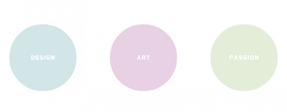
Demo
First off, because I know you like to see one, here is a demo of what we are going to be creating. You’d obviously place these into your site design, but for this demo I’ve centered them in the page.
Taken a peek? It’s been tested & confirmed as working in the latest versions of all common browsers including IE 10. Do note that this will not work in older browsers and, just because it’s a pain in the ass, IE 9 and lower. I won’t be explaining how to fix that problem, but I will be discussing what you could do to reduce the impact at the end of the tutorial.
HTML
The HTML for this is pretty simple.
|
1 2 3 4 5 6 7 8 9 10 11 12 13 14 15 16 17 |
<div class="container"> <div class="outer"> <div class="circle one"> <p>Design</p> </div> </div> <div class="outer"> <div class="circle two"> <p>Art</p> </div> </div> <div class="outer"> <div class="circle three"> <p>Passion</p> </div> </div> </div> |
This is the HTML from the demo. It’s a little difficult to explain, but all you really need is the div.circle element. The other elements are simply there to make the demo look nice although they may be of use to you in some cases.
As an example the div.outer elements are used to push the circles out of document flow, this means they will not move the other circle elements when they grow as that could be seen as an annoying effect by the visitor. The container simply centers everything.
That’s all the HTML there is, the actual animation is achieved using CSS. So let’s take a look at the CSS.
CSS
First let’s take a peek at the CSS needed for just the circles.
|
1 2 3 4 5 6 7 8 9 10 11 12 13 14 15 16 17 18 19 20 21 22 23 24 25 26 27 28 29 30 31 32 33 34 35 36 37 38 39 40 41 42 43 44 45 46 47 48 49 50 51 52 53 54 55 56 |
.circle { position: absolute; /* MAY NOT BE REQUIRED, USED FOR OUR DEMO */ width: 200px; height: 200px; background: #dedede; border-radius: 9999px; -webkit-transition: all 500ms cubic-bezier(0.600, 0, 0.735, 0.045); /* older webkit */ -webkit-transition: all 500ms cubic-bezier(0.600, -0.280, 0.735, 0.045); -moz-transition: all 500ms cubic-bezier(0.600, -0.280, 0.735, 0.045); -ms-transition: all 500ms cubic-bezier(0.600, -0.280, 0.735, 0.045); -o-transition: all 500ms cubic-bezier(0.600, -0.280, 0.735, 0.045); transition: all 500ms cubic-bezier(0.600, -0.280, 0.735, 0.045); /* easeInBack */ } .circle:hover { margin-left: -20px; margin-top: -20px; width: 240px; height: 240px; } .circle:hover p { line-height: 195px; font-size: 24px; } .circle p { text-align: center; color: white; text-transform: uppercase; font-family: 'Exo', sans-serif; font-size: 18px; line-height: 165px; letter-spacing: 2px; -webkit-transition: all 500ms cubic-bezier(0.600, 0, 0.735, 0.045); /* older webkit */ -webkit-transition: all 500ms cubic-bezier(0.600, -0.280, 0.735, 0.045); -moz-transition: all 500ms cubic-bezier(0.600, -0.280, 0.735, 0.045); -ms-transition: all 500ms cubic-bezier(0.600, -0.280, 0.735, 0.045); -o-transition: all 500ms cubic-bezier(0.600, -0.280, 0.735, 0.045); transition: all 500ms cubic-bezier(0.600, -0.280, 0.735, 0.045); /* easeInBack */ } .one { background: #d1e6e8; } .one:hover { background: #a7c0c3; } .two { background: #e8d1e5; } .two:hover { background: #cfacca; } .three { background: #e3eed9; } .three:hover { background: #bccfac; } |
This is just the code related to the circle, I haven’t included the CSS that centers the demo. If you need that code load up the demo & you can find it in the source code.
It’s surprisingly simple despite how complicated CSS transitions/animations can seem to be. The main effect is created simply by transition: all 500ms cubic-bezier(0.600, -0.280, 0.735, 0.045);. The cubic bezier is a special easing function to give the bounce effect. You can even make your own easing using a tool such as Ceaser.
Now you might be wondering why the p inside has an animation applied. Well if we didn’t animate that too it would jump horribly when you hover the circle. Animating the text keeps it in sync with the circle. You could probably avoid this problem completely by moving the text outside the circles & positioning it, but this is the way I’ve decided to go for. If you do try another method you think works well please share them in the comments (maybe using JSbin or something similar), I’d love to see them.
Before we finish let’s take a quick look at why transition works? Well the transition property tells the element to move smoothly between the two values of the properties mentioned when they are changed. So for example using the Pseudo element :hover causes the properties (in this case margin, width, height & background color) to smoothly animate when hovered.
You can do some pretty amazing things with CSS now that you can use transitions and, if you are willing to deal with spotty support, keyframe animations. Just remember that you need to consider browser support & how to deal with unsupported browsers.
Browser Incompatibilities
As I mentioned while this technique is awesome, because it requires no JavaScript & because it is using the browser it can be hardware accelerated (depending on the code used), it does have spotty support at the moment. I haven’t dealt with this in this tutorial as unfortunately I only have time to do a small tutorial, but I’m going to list a few ways you could deal with it.
- Forget about it
Don’t bother with any fall-backs. If you can guarantee that all visitors will be using a supported browser then don’t bother with a fall-back. - Use Modernizer & JS
You could duplicate the transitions using jQuery (or any other library) and use Modernizer to switch between the CSS & JS depending upon support. Probably the best idea - Use Modernizer & an alternative
Again use Modernizer for CSS transition support detection & if not available load a complete different menu for those visitors.
If you have an alternative that you like to use & I haven’t mentioned then please share it with us in the comments.
2 Comments
tormahiri
thanks for sharing i’m tested very lot helped me
Lauren
Thanks for sharing.