Creating A Polaroid Effect With CSS
To create this Polaroid we are going to be using some CSS 3 properties which means it won’t work in Internet Explorer 7 or 8. However it’s nice to learn things like this now ready for when those CSS properties are mainstream in all browsers.
I have two ways of creating the Polaroid. They are nearly the same however one is probably wrong semantically, but it looks a little more realistic (or at least I think it does).
CSS Polaroid Method 1
First let’s look at the HTML used for this method. It’s really simple.
|
1 2 3 4 |
<div class="polaroid"> <img src="image.jpg" title="I am an image" alt="What?" /> <span>This is a Polaroid!</span> </div> |
The caption (span tag) can be omitted if you like, but I kinda liked the writing on the bottom of Polaroids. See I said the HTML was simple.
Now let’s add some CSS to make it look more like a Polaroid.
|
1 2 3 4 5 6 7 8 9 10 11 12 13 14 15 |
.polaroid { position: relative; background: #fff; width: 200px; padding: 7px; margin: 10px; text-align: center; -moz-box-shadow: 1px 1px 3px #222; -moz-transform: rotate(-5deg); -webkit-box-shadow: 1px 1px 3px #222; -webkit-transform: rotate(-5deg); box-shadow: 1px 1px 3px #222; -o-transform: rotate(-5deg); transform: rotate(-5deg); } |
Let’s see what’s going on in this CSS. We position the element relative, you don’t have to add this but using the transform property later will automatically make the element act as if it was positioned relative. We add the classic white background. Then I have set a width to match my image, you must add this. Some padding adds the white border, and some margin just adds some spacing feel free to adjust both. Text align for the caption, remove if you aren’t keeping the caption.
Now we get to the browser specific CSS properties. I’m only going to explain the properties once as it’s the same regardless of browser prefix. First we add a nice shadow using box-shadow, offset from the left & top by 1 pixel and blured by 3px, we also use an off black color as black would probably make the shadow too strong. Next we use transform with rotate to give the Polaroid a little bit of rotation. You don’t have to add that, but it’s a classic effect for a Polaroid & I couldn’t miss it out. 😉
Just a small note. Opera doesn’t need the -o- prefix on box-shadow and transform is there so that the effect doesn’t fall apart when browsers no longer need their prefixes.
I know you are probably eager to see what this looks like, so here is an example.
Chuck’s Yvonne Strahovski
CSS Polaroid Method 2
There is a slightly different method that gives a little bit of a more realistic look by adding an inset shadow to the image. The problem with inset box shadows is that they appear above backgrounds but below content. To solve that we make the image a background of a div element instead of a img element. As I said you may not want to do this, but I can’t see any reason it’s a bad idea.
The main difference is in the HTML, so here we go:
|
1 2 3 4 |
<div class="polaroid"> <div style="background: url(image.jpg); width: 200px; height: 200px;"></div> <span>This is a Polaroid!</span> </div> |
As you can see I’ve replaced the image element with a div using a inline style. Now we can add this CSS rule:
|
1 2 3 4 5 |
.polaroid div { -moz-box-shadow: inset 0px 0px 5px #000; -webkit-box-shadow: inset 0px 0px 5px #000; box-shadow: inset 0px 0px 5px #000; } |
This will give the image an inset shadow because it is now a background rather than content. Here is what the example looks like.
Chuck’s Yvonne Strahovski
The inset shadow is very subtle and is hard to see on certain pictures. So here is what it looks like without the image so you can see it clearly.
Blank Example
There we have it. Two examples of how to make a Polaroid effect using CSS, no Javascript or layout based images, just CSS. There is something to note though. With some of the CSS properties used being experimental, different browsers render this effect to a different standard. Chrome for example doesn’t anti-alias rotation on images very well, Firefox doesn’t anti-alias rotated text very well, Safari also seems to have a similar problem, however Opera seems to not have any problems and renders these examples the best. All of these problems will (hopefully) disappear though as the new properties become more commonplace.
I hope this tutorial has helped you, or at the very least been informative. If you have any suggestions, ideas or questions please feel free to ask them in the comments & I’ll get back to you ASAP.
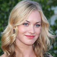
N.B: The image used inside the Polaroids is of Chuck star Yvonne Strahovski. It is used for illustrative purposes only. If you own the copyright & would like it removed please contact me.
10 Comments
iTechRoom
That’s a cool idea, Thanks for sharing.
Paul Robinson
Thanks. I was hoping it might be useful to others and not just me. 😉
Therese Reuterswärd
Great job Paul!
Please can you tell me more about the styling required to have the wp-captions text appear on top of the polaroid? (I do the non-div-style and the caption just keeps ending up outside of the polaroid pic)
Thank you! /Therese, Sweden
Paul Robinson
Hi Therese,
Due to the HTML code being different it would be a little tricky, however it should be possible.
I don’t have access to the code created for captions right now, but it should just be wp-caption as the class instead of polaroid. You would also need to see what the text is contained in and change the CSS rule relating to that.
I’m sorry I can’t be more detailed, I’m on my iPod and dont have easy access to the caption code.
Let me know if any of that helps. If not I’ll try to help some more when hopefully I’ll be back at my computer.
Renji
Also added a hover effect to it. Thanks Paul.
p.s. you appear to be a big fan Yvonne Strahovski… seeing her in all your examples. 😉
Paul Robinson
No problem. 😉
Well fan of Chuck (the TV show) in general, but like my author blurb says, yes a huge fan of Yvonne. 😛
I get bored of seeing all these tutorials using random pictures so I thought it would make a change to use a picture of someone I’m a fan of, and who better than the gorgeous Yvonne. 😆
philip harper
Brilliant stuff! that is really easy! – I’m fairly new to html + css and this is super helpful! thanks again
Paul Robinson
Hi Philip,
Glad it was helpful.
Gaetan
Nice tutorial thnx, could you maybe shine your light on: making the picture called upon conditionally, so i dont need to define its url in the html but could tackle it with shortcode in the post/page editor. I mean that somebody at author level could chose and add a polaroid without having to touch code.
Thnx
Paul Robinson
Hi Gaetan,
This would be more of a WordPress tutorial, and is actually more complicated than it might first seem. Making the Shortcode is fairly easy and I think I created a tutorial about a while ago, however adding it to TinyMCE is a whole different story and is fairly difficult. If you do a search here for ‘shortcode’ you get all three tutorials that you’d need as the first three results.
Give then a shot and if you still have issues drop me an email & I’ll see if I can help you out.