Using HTML to Liven Up Your Zazzle Gallery Home Page
IMPORTANT: As of June 2013, Zazzle announced that HTML will no longer be allowed within the description area of our store home pages.
You’ve just opened an account with Zazzle. You’ve created a few products, uploaded a spiffy header, added a few product lines and wrote a nice little paragraph welcoming people to your gallery… but you yearn for something more, something different!
This tutorial gives a few little hints and tips on how you can jazz up your Zazzle gallery home page using nothing more than a few HTML tags, a few images and your imagination!
Okay… Tell Me More!
There are literally thousands of individual galleries on Zazzle all striving to be just that little bit better than the others. Apart from having great designs, making your home page different from your competitors is a step in the right direction. I can hear you all asking yourselves,
“OKay, so why are you giving us these tips? Shouldn’t you just keep them to yourself?”
Well, I like to help out my Zazzle pals the best I can. Without it’s community of artists and designers Zazzle would cease to exist so to ensure people keep coming back to Zazzle with their fat wallets, it’s vital that we utilize the method of creating our galleries effectively and give our galleries a professional feel!
Really Basic Stuff… Using the <a> Tag
Apologies to those who are familiar with this already… it has to be done! Editing what appears on your gallery’s home page takes place on the Basic Information page. You can find this page under the Gallery tab of MyZazzle. At first glance the description box appears as though it would only accept text but Zazzle do allow us to use a few HTML tags and the <a href="#"></a> tag is one of them.
The <a href="#"></a> tag is used when you want to turn text (or an image) into a link. Simply wrap it around the word/s or image, place the path to the web page you’re linking to between the quotes and voila… you have a link. It’ll look something like this when using text as a link (image links are explained later):
|
1 |
<a href="http://www.webpage.com/page-one">Visit my website</a> |
Here’s a useful tip when using the <a> tag: If your link navigates people away from Zazzle i.e., your own personal website, add target="_blank" after the href="". When the link is clicked, it will automatically open the webpage in a new browser tab. This means that potential customers can easily get back to your Zazzle gallery.
Using Your Product Images to Create a Feature
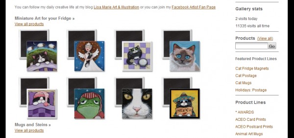
Creating something like what you can see above with rows of images is quite simple. All it requires is for you to copy and paste a few links from the ‘Share this’ page of all the products you want to make a feature of. Just click on link which is found below the ‘Add to Cart’ button, and you’ll be confronted with a page which contains a few links that you can copy and paste. The one you want to copy is ‘Option 2’. You’ll need to get rid of a few bits of code before you can use it and I find it a lot easier to paste it into Notepad first and do this… but you don’t have to. The code you have, should look something like this:
[code lang=”html”]
<div style="text-align:center;line-height:150%"><a href="http://www.zazzle.com/easter_kitty_greeting_card-137053438753880521?rf=238422722583517014"><img style="border:0;" src="http://rlv.zcache.com/easter_kitty_greeting_card-p1370534387538805218g3x_325.jpg" alt="Easter Kitty Greeting Card card" /></a><a href="http://www.zazzle.com/easter_kitty_greeting_card-137053438753880521?rf=238422722583517014">Easter Kitty Greeting Card</a>by <a href="http://www.zazzle.com/lisamarieart*">LisaMarieArt</a>Design a<a href="http://www.zazzle.com/custom/notecards?rf=238422722583517014">picture note card</a> With <a href="http://www.zazzle.com/?rf=238422722583517014">zazzle.com</a>Browse more <a href="http://www.zazzle.com/major+holidays+cards?rf=238422722583517014">Major Holidays Cards</a></div>
[/code]
The only part you need is the <img src="path/to/image" /> and it’s surrounding <a href="path/to/webpage"></a>. You’ll find the section you want just after the opening <div>. Delete everything that isn’t needed and you should end up with something like this:
|
1 |
<a href="http://www.zazzle.com/easter_kitty_greeting_card-137053438753880521?rf=238422722583517014"><img src="http://rlv.zcache.com/easter_kitty_greeting_card-p1370534387538805218g3x_325.jpg" alt="Easter Kitty Greeting Card card" style="border:0;" /></a> |
Here’s a useful tip when using Zazzle’s images: Just before the .jpg of each image is a 3 digit number preceded by an underscore. E.g., ...87538805218g3x_325.jpg This 3 digit number controls the size of the image in pixels and can be changed to whatever you want. The overall width of your gallery’s home page is 671px so just divide 671 by the number of images you want to show on the same row. So for example, changing the 3 digit number to 133 or 134 will allow you to fit 5 images on the same row.
Once you have everything you need, it’s just a simple matter of pasting it all into the description box on your gallery’s Basic Information page. Combine this with a bit of text and you should be able to create something quite spiffy.
…But There’s More
If you want to go one better try using the <table> tag! Yes, believe it or not, Zazzle do allow you to use tables. You can’t use any of the fancy attributes like cellpadding or cellspacing but that doesn’t matter because you can still make some pretty spiffy gallery home pages. All you need is something like this:
|
1 2 3 4 5 6 |
<table> <tr> <td>Place image here</td> <td>Place text here</td> </tr> </table> |
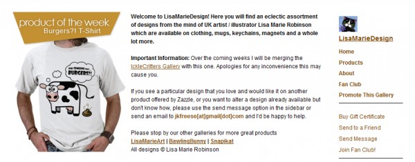
The above can be used to make your text appear to float to the right of an image. You can see an example of this by visiting my Gallery: LisaMarieDesign or looking at the image a little further on. Tables are made up of rows (<tr></tr>) with cells (<td></td>) inside them. If you want a table which is 3 rows high and 2 cells wide, the code would look like this:
|
1 2 3 4 5 6 7 8 9 10 11 12 13 14 |
<table> <tr> <td>Place something here</td> <td>Place something here</td> </tr> <tr> <td>Place something here</td> <td>Place something here</td> </tr> <tr> <td>Place something here</td> <td>Place something here</td> </tr> </table> |
Experimenting is the key. Just remember that the width of the gallery home page is 671px so any images you add must be no wider than this. You’ll also need somewhere to host any graphics/images that you make. I use my own website but you could use Picasaweb by Google which is completely free.

Here’s a useful tip for creating graphics which contain images of your products: If you’ve noticed, the graphic element I’ve used on my home page (see image above) contains one of my products. This was done by taking a screenshot of the product’s page and then copying, resizing and fitting it into my graphic using Photoshop but any image editing software will do! Just press ‘Print Screen’ on your keyboard to save a screenshot to memory, create a new blank image in your image editing software and press ‘Ctrl + V’ to paste the screenshot … then you can do what you like with it! (You may need to adjust the size of the blank image to be the same as your screen resolution if your software hasn’t done it for you. E.g., my screenshots are 1440 x 900.)
…and that’s pretty much it! The only other HTML tag which you might find worth using is the <font> tag. You can use it to change the color or size of your text. For example:
|
1 |
<font size="3">This is size 3 text!</font> |
|
1 |
<font color="#000000">This is black text!</font> |
One more thing! Remember to delete any unwanted spaces or returns within your code. Zazzle will automatically turn any returns into <br/> tags and cause extra space to appear. In other words, if you want 4 images to appear side by side, all of the <img> tags must also appear side by side. No returns, no spaces.
So there you have it! Let your imagination run wild and use a little bit of HTML to create your Zazzle gallery home page. But before I go, here’s another tip… The gallery home page isn’t the only place you can use HTML! You can also use it in the description box for your product lines to do truly magical things…. Want some inspiration? Check out my Awards page which was created using a product line which contains no products.

15 Comments
Sherry Holder Hunt
Thank you! I’ll have to give this a try soon.
Mariana
Thanks I’ve been wondering how to place product images on my store front … one of these days I may even have time to try this out!! 🙂
Heidi
you are wonderful for posting this and for doing it in language that actually makes sense to a non-techie. Thank you, thank you, thank you. I’ll be working on this over the weekend, as my first test appears pretty good!
djskagnetti
great job on this =)!!
cassandra
thx so much! my zazzle website looks great now!
Tamika Hall
Thank you for posting this information!! It is exactly what I have been wanting to do. THank you!! God Bless! Tamika
NR
Thanks for the information. If you have time could you answer a question please?
I would like to add a small gif animation (or possibly just a picture) within the store description.
I think this is done in the edit portion, however I don’t know the proper html tags. Can you help? Thanks NR
LisaMarieArt
An animated GIF is basically just an image so you would use the same method as you would for an image.
Go MyAccount -> Store -> Basic Information
Then place the following in the description box in the place you’d like it to appear:
Replace the bit in quotes with the URL path to the GIF. If you want to make it a link use this:
Hope this helps.
Livy
Thanks so much for the info. I don’t know much about using html. Now I will be trying out some new things on my store.
VillageHut
Well done! I am so pleased I have this to help me with my boring set up. Just enough info to get my page looking a little bit better.
Thanx!
skystudiohawaii
Thanks for the info.
Isn’t html wonderful !
Just magical.
Claire
Excellent tips! I’ve been wanting to redo my store design and your tutorial has given me some very useful concepts to mull over. Thank you!
Pam Blackstone
Hi LisaMarieArt,
You’ve done a great job explaining this .. one of the clearest explanations I’ve seen of HTML basics. My problem is I can’t find WHERE to put the code to customize my store. I want to adjust the left-hand nav bar, with my merchandise by product type (I currently have it categorized by design type). The settings in the store’s back-end only seem to allow one to modify the description on the right-hand side of the screen.
My store is at http://www.zazzle.com/fractallicious, if you’d like to have a look.
Thanks for any advice you can offer.
Pam
LisaMarieArt
Hi Pam,
Sorry it’s taken so long to get back to you.
Unfortunately, you will need to venture in to the Advanced Customization as this tutorial only explains how to jazz up the description which shows on your store home page.
It’s a lot more technical and there is a great tutorial in the forums: http://forum.zazzle.com/advanced/how_to_add_images_to_sidebar Although it explains how to add images, you would use the same techniques but replace the image with an HTML list of products instead. Example:
laura nikiel
Hi Lisa, Just ran across your blog, I’m putting together my zazzle store – thanks for all your info – so helpful! Love your illustrations too!