CSS Tip: CSS Media Queries
Media Queries are exceptionally handy pieces of code that allow you to easily alter the styling of your website when viewed at specific widths. This is great for making your site easier to use on handheld devices such as smartphones and tablets.
I’m not going to go into any detail on how you could change a website, that’s a tutorial more suited to be written by a web designer rather than a coder like myself. Instead I’m just going to give a quick overview of how they are written, that way you can always find how to write them quickly & easily, and hopefully it might introduce them to some people who haven’t yet come across them.
How Do I Write One?
Well you can use two different Media Queries used to monitor the inner width of your browser window. They don’t differ in how they monitor, more when they are implemented. As an example let’s take this query:
|
1 2 3 4 5 |
@media screen and (min-width: 980px) { .example { width: 200px; } } |
This query would only take effect if the minimum inner width of the browser window was 980 pixels. If it is any smaller all the CSS rules inside the block will be ignored. You can do a similar query but with max-width.
|
1 2 3 4 5 |
@media screen and (max-width: 600px) { .example { width: 100px; } } |
This query would only take effect if, you guessed it, the maximum inner width of the browser window was 600 pixels. If it is any larger the rules inside this block will be ignored.
In theory this is extremely powerful and can be used to make multiple incarnations of your sites theme/style by making certain elements change size, or even disappear if viewed on a browser with a certain size window.
I’m Struggling, How About An Example?
Go on then, you’ve twisted my arm.
Now I should warn you in advance, this is nothing fancy, just a big bold illustration of how Media Queries can alter styling depending upon the browsers inner width. In this case it changes the background color.
When you open the demo resize your browser window’s width to see how the Media Query changes the background color as it gets smaller. Click below for the demo, then I’ll explain the code with some nice pictures.
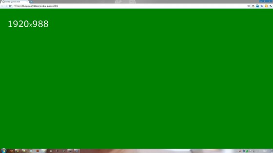
Okay. Now that you’ve seen the demo let’s go through the code. First an image to show which color/width the media query affects.

As you can see when the browser is full width, in my case 1920×988, the color is green. The Media Query will keep the background green until the browser width drops below 980 pixels. Here is the code that does that:
|
1 2 3 4 5 |
@media screen and (min-width: 980px) { body { background: green; } } |
You can see it’s very similar to the query I showed you before. We are asking if the browser’s width is any size above (or on) 980 pixels. Hopefully seeing the code & seeing it in action together will help make it easier to understand. Now let’s take a look at the second color.

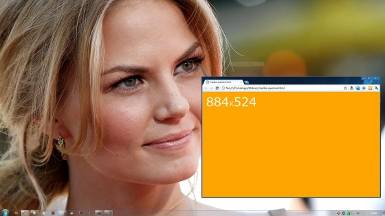
When the browser’s width drops below 979 pixels the background changes to orange. It’s important to note that the height does not need to change. I changed the height of my browser simply because I had a screenshot program open too. Let’s take a peek at the code for this one.
|
1 2 3 4 5 |
@media screen and (min-width: 600px) and (max-width: 979px) { body { background: orange; } } |
You can see this one is slightly different. All it basically says is that provided the browser’s width is on or between 600 & 979 pixels the background will be changed to orange. Finally let’s take a look at the last Media Query.

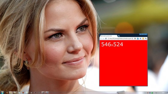
Finally we have the red background when the browser’s width drops below 599 pixels. Here is what the code looks like:
|
1 2 3 4 5 |
@media screen and (max-width: 599px) { body { background: red; } } |
It’s pretty similar to the first query, the only difference is we are asking if the width is up to 599 pixels by using max-width.
One question you may have is why do I have screen at the beginning of each query. Well that is simply to tell the browser you only want to apply the styling to screen output, so it wouldn’t apply these styles if you were to print the page.
Which Browsers Support Them?
Excellent question. Media Queries are supported on IE9+, FF5+, Chrome 12+, Safari 4+, Opera 10.6+, iOS 3.2+, Android 2.1+. Hopefully that covers most of the popular browser around. The most important thing to note is that they are well supported on both of the most popular smartphone/tablet platforms, Android, and iOS.
Hopefully this little look at CSS Media Queries has been helpful, or even introduced them to you for the first time. If you have any questions, or you’ve used them in your website please leave a comment below. I always happy to answer any questions I can.
Thanks for reading, and if you need any help with any of my tutorials or you have a project you’d like me to work on please head over to my hire me page to contact me about any prospective work. You can also find some ball park prices there for common WordPress related work.